

Client
Brilltek Co., Ltd.
Scope
Logo, type, color, pattern, applications
role
Visual Identity Design
year
2023
01
Genericx tech, weak recognition.
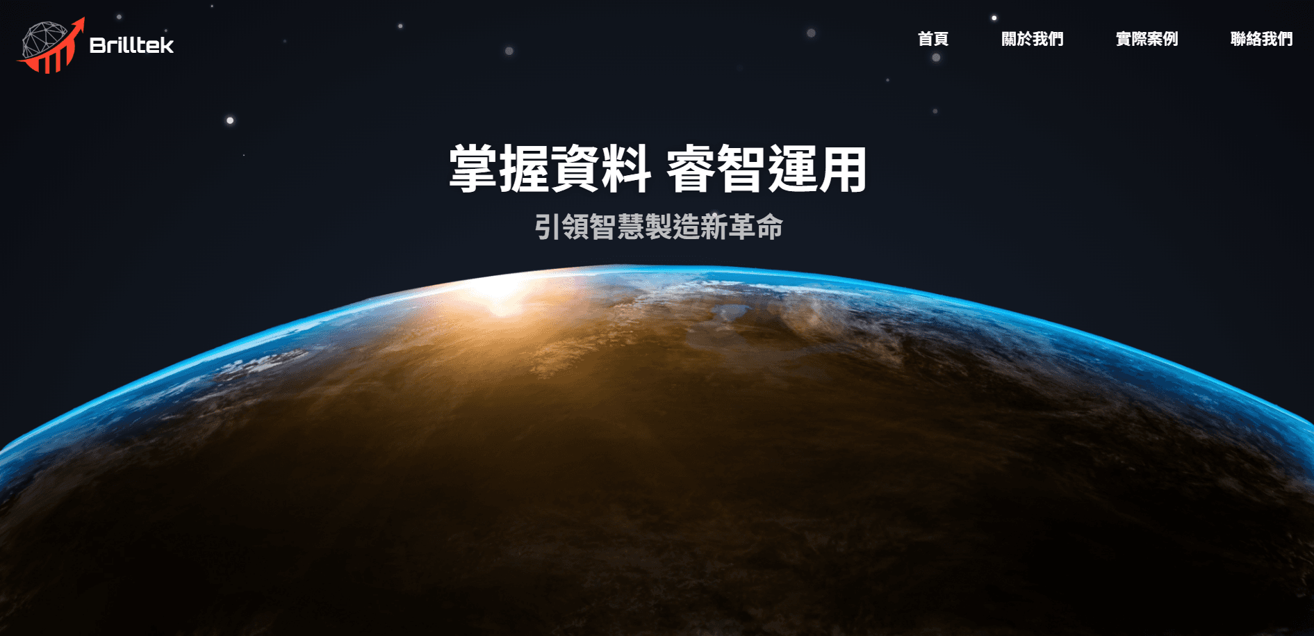
Original homepage and Logo
01
Space background and red arrow felt generic.
02
The logo had too many elements to stay clear at small sizes.
03
The visual style did not connect to Brilltek’s data-system work.
02
Minimal · Innovative · Energetic
03
1+0 becomes bR.





Construction — grid and geometry

Logo mark — primary lockup
04

Color — Vital Blue #1E6FFF

Type — 思源黑體 TW & Source Sans Variable

Pattern — three graphic sets

Logo Lockups
05
Signage, stationery, documents, tote bags

Signage — illuminated wall sign

Stationery — business cards

Documents — folder and letterhead

Merchandise — tote bags
06
Before

Three shapes stacked
Diamond + bars + arrow
After
BRILLTEK
Four strokes, one system
Two 1s, two 0s
07
Brilltek Co., Ltd.
Brand Identity Case Study · 2023